|
Halloween is ripe with great imagery, so this time I just reveled in the spirit of the season. There is no hidden meaning or underlying joke, except perhaps for the nice alliteration of the title. It's just a sort of surreal "Halloween Happening."
|
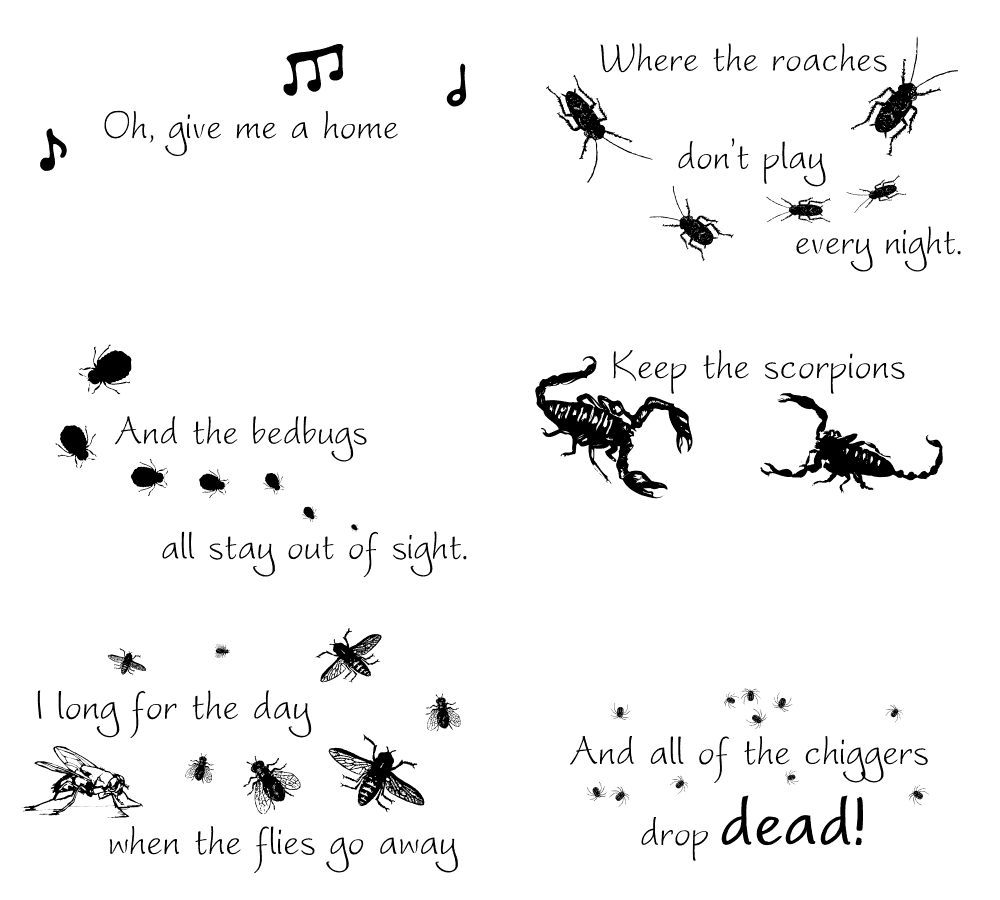
There are times when I think I might never run out of silly ideas for even sillier animations. "Home Less Bugs" not only has a minor pun for the title, but I think I did pretty well at butchering the words to the familiar song about a happy country house with cavorting ungulates.
Even though we don't often have snow here in central Texas, snowflakes are universally attractive. There are some very nice dingbat font characters available that feature these ice crystals, so the only difficult part was choosing which ones to use! "Snow Removal" is actually two animations side by side. If you look carefully, you will see the duplication.
  |
We don't usually feature Groundhog Day with our January issue, frequently opting for the more popular Valentine's Day. However, after recently watching the classic movie "Groundhog Day" with Bill Murray, I guess that was more on my mind. It also happens that over the past year or so I'd been writing a poem on the same theme and used it in this issue. Yeah, writing poetry is not something that just happens for me; there's no inspiration, just muddling through the morass of the mind. Anyway, the poem was about using bugs instead of a rodent to forecast the weather, hence "Groundbug Day." Besides using a dingbat font for the cricket, I used a Bamboo tablet to draw the clouds and snow. About the only thing I use the tablet for is to make lines that gradually increase or decrease in size. Luckily, it's very simple to just plug it in and use it with PhotoShop Elements 2.
 |
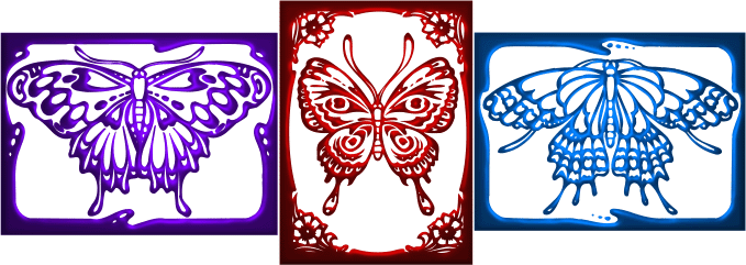
Lack of inspiration resulted in "Butterfly Trio." I'm not sure I mind it much when I can't think up an animation, since I really enjoy playing around with dingbat fonts and special effects, especially when they come out this pretty.
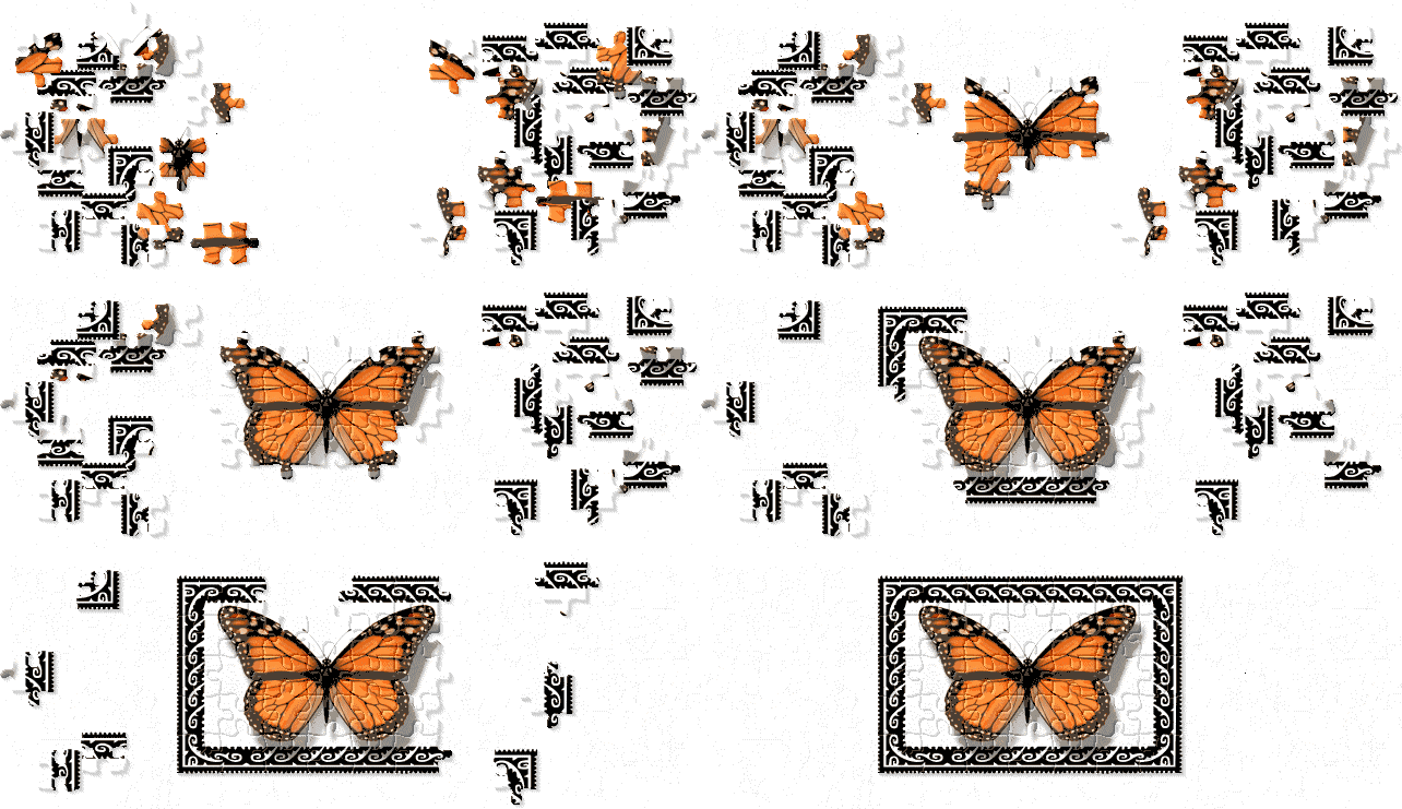
For the next issue, I had written an essay about jigsaw puzzles, so it was natural to think of an animation which used that theme. The question was: how to create it? I settled on using a neat little program I have called "Living Scenes Jigsaw Puzzles." It allows for using any image and turning it into a puzzle with a wide variety of parameters. I made the image first, using a clipart butterfly and putting a nice dingbat font border around it. Then I turned it into a puzzle, with the scattered pieces arranged the way I wanted them. I then did screen shots as I put the pieces in place. I had to do the whole thing with no slips in placing the pieces because then I would have trouble putting the piece back to exactly the same spot and trying again. It was tense towards the end, as I didn't want to have a mouse-slip screw up my 15 minutes of work. Once it was finished, I was quite pleased - I think "Monarch Puzzle" is one of the most elegant and attractive animations I've ever made.
|
I have a cute little program on CD that I bought for $1 or so at Half-Price Books years ago called "My Type Artist." It has a bunch of graphic fonts that can be used for making headings and such. I sometimes use it to create the heading for the newsletter and this time I used one that put each letter into a sort of capsule. It was then a no-brainer to use the same kind of capsule, elongate it and stick a bug inside. The bug is from a dingbat font. Once I had created it, I was surprised to see that there was a problem with how the frames removed themselves, as there were little marks left after the bug. Perhaps I had cropped too closely or something. This didn't seem too detrimental to the effect, though, as the marks looked like little footprints!

Why had I never thought of "Fire Ants" before? It's not like I am not almost constantly aware of the little beasts since I am always getting stung. And I certainly love puns. I've also used this flame effect from Ulead Photo Express for several previous graphics, so it was just a matter of time before I applied it to this particular taxon.

One of my activities (when I'm not making silly animations) is giving slideshow presentations about insects to various nature groups. I had just created a new talk about pollination and one of the points I brought up is that, while bees are the most important insect pollinator, flies are the second most important. Most people don't know that. Since "Fly Feast" has a nice alliteration (well, I guess I could have used bee banquet - maybe next time), that became the title. More dingbat fonts, with the flowers painted in PhotoShop Elements 2. I have no intention of ever buying a later or more complex version of PhotoShop; it would be a waste of money. The simple but pretty border was created by nesting tables.
|
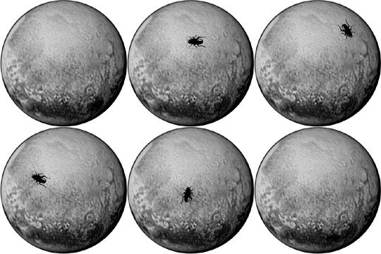
The next graphic could not have been created even a month ago, as the big news was the recent rendevous of the New Horizons spacecraft with Pluto, resulting in the first published detailed images of the dwarf planet. Of course, there are no insects on Pluto, but it's fun to pretend.
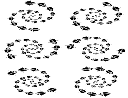
Continuous looping graphics lend themselves to spirals or other hypnotic phenomena. "Whirligig Whirlpool" began as a dingbat font character, which was then multiplied, resized and spaced out. It was originally a symmetrical round image, but seemed a bit boring, and also didn't fit the horizontal format that I prefer for these pictures, so I squished the whole thing down using PhotoShop Elements 2. I always like when an animation remains light in bandwidth even with transparency.
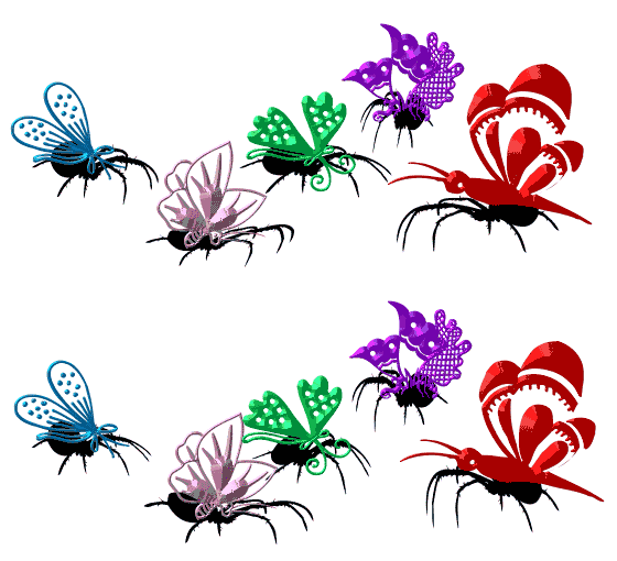
Too much creativity lately, as well as too much else going on, so it was time to relax and cop out with a pretty, but static, graphic. It's nice how putting sharply outlined 3D effects on text (such as the dingbat characters used here) creates the illusion of a metallic patina. I like the title "Filigreed Fliers" so much that I think it sort of makes up for the lack of motion.

I can't let the Halloween issue go by without exploiting the wonderful imagery associated with that holiday. The similarity in look (metallic-looking butterflies) to the last graphic is obvious, but I thought it was a cute idea to have spiders dressed up as their prey and dancing about in "Spider Masquerade Ball."
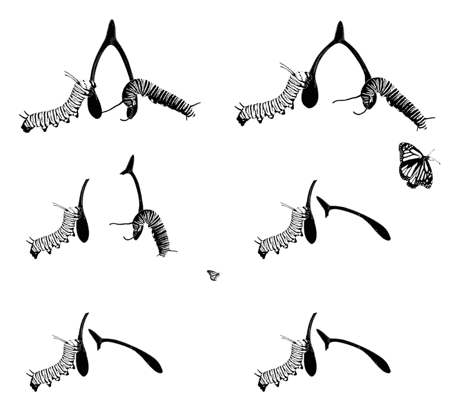
I'd really hoped to find a dingbat font character of a wishbone for this particular idea, but it just never materialized. Instead, I simply took a generic looking image off the web and did the stretching and breaking using PhotoShop Elements 2. The caterpillars, though, were from a font. As the Thanksgiving issue theme, I thought the idea of "Monarch Wish" fit in very well, especially as the monarchs migrate through our area in both the spring and fall.
 |
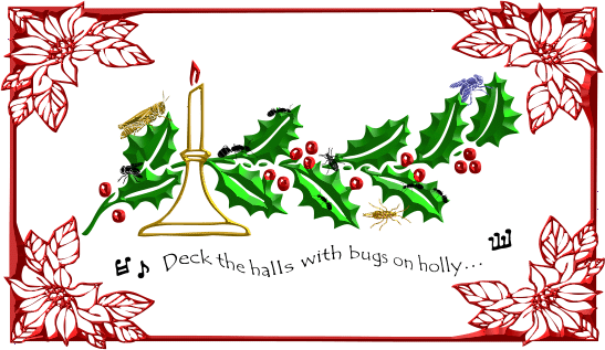
Assuming that I'd do an animation for Christmas, I just started messing around with the various imagery for the holiday. It turned out that the idea that grabbed me didn't need animation at all, as "Deck the Halls with Bugs on Holly" says it all in one frame. The nice wavy text was done with Ulead Photo Express. For a very old, very simple, free program, it is amazingly versatile and fun to use.
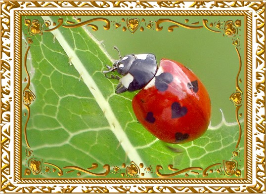
It is surprisingly easy to use PhotoShop Elements 2 to touch up real photos. I sometimes use it to remove debris or pieces of grass that obscure my insect subjects. It took very little manipulation to enhance "Lady Love" for Valentine's Day. The gold filigree border was created from dingbat fonts. The subject is the Seven-spotted Lady Beetle (Coccinella septempunctata).
Having not done an animation for a couple of months, it seemed appropriate to play with the idea of February being the month in which we add the extra day for leap years. I'd already decided to call it "Leap Year" and plenty of insects jump about. I decided on a sort of disconcertingly odd dingbat font character that vaguely looks like a pest species of unknown taxon. Although it would probably be more characteristic of a Halloween subject, I enjoyed making the bug leap right into the face of the viewer. I'm not particularly satisfied with the rectangular limitations of the final frame, but it luckily only lasts a short time.

I just couldn't seem to escape the attraction of Halloween-type imagery. Perhaps I am too intrigued by the Tim Burton film "Nightmare Before Christmas." I really like the idea of merging holidays, so this time I started with the Easter egg theme, but everything I thought up had a dark quality to it. Messing about with varying transparency for each frame produced "Creepy Egg."

Well into spring, I still seemed drawn to slightly macabre images. In reality, there is nothing demonic about scorpions, but humans do tend to assign arbitrary implications to other species. Of course, scorpions sting, but that is just their defense against predators. The idea of mating rituals is easily associated with springtime, and "Dance of the Scorpion" is based on an actual behavior. Scorpions do not mate directly; the male places a spermatophore on the ground and the female must pick it up using appendages on her underside. The pair clasp claws because that keeps the most dangerous weapons of these hunters at bay. The male leads the female back and forth until she has grasped the deposited spermatophore. At that point, the relatively peaceful interaction ends and the female often attacks the male, who, subsequently, often runs away.
The images are yet another dingbat font character. I can't emphasize enough how versatile and fun these are to work with. The whole process, from choosing the character to coloring and enhancing it, makes me feel like a kid with a big box of crayons.

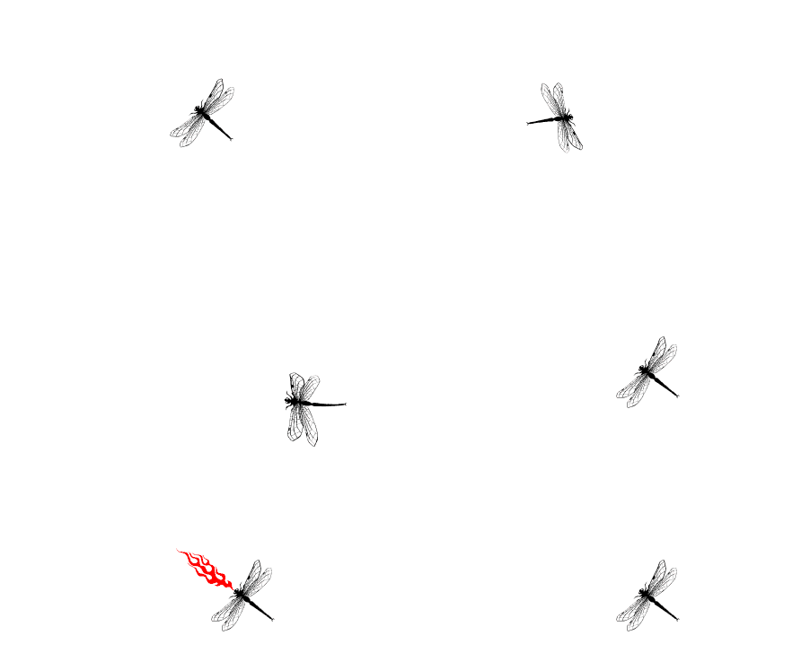
Anyone who has seen the movie "How to Train Your Dragon" knows where the idea for "Dragon Fire" originated. Who doesn't love flying dragons that breathe fire?! While dragonflies are supreme aerial predators, their weaponry does NOT include fire. Too bad.
A GIF animation connoisseur might notice that this and the previous three animations have all had transparent backgrounds. I really like to use transparency whenever possible because it helps the graphic integrate onto the page. The big limitation is that sometimes the bandwidth usage is higher when applying transparency due to having to return each frame to the underlying background. This wasn't the case in any of these instances.
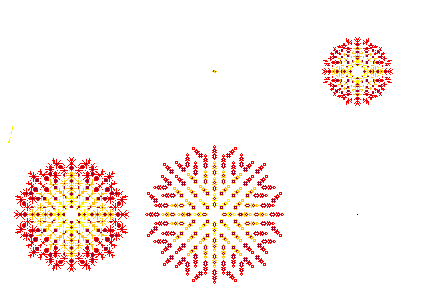
Even though I've already done fireworks themes several times in the past, I just cannot resist returning to such a visually satisfying image. "Firework Ants" plays on the idea of almost all ants in a colony being workers, not to mention the high-profile Imported Fire Ants that live in the southern U.S. I started with pixel art ants that I created for my website a long time ago. It's fun to sometimes create pleasing geometric patterns and then color them. I also like the way the trail of a firework traces itself against the sky, creating the anticipation of the delightful surprise when the explosion finally occurs. As with snowflakes, the infinite variety of fireworks is a significant piece of their charm.
 |