|
The arrival of Independence Day always makes me want to include something on the theme of fireworks, explosions, patriotism, or all of the above. This time fireworks won out, with "Fireflies and Fireworks." The idea came easier than the implementation. Each different fireworks explosion is a separate graphic, with different timings to make sure they were never in synch for long. The fireflies are an animated background within the table. I probably should have made the fireworks transparent so there would not be a dark area around each one, but by the time I'd made all the different graphics, I didn't feel like spending the time on it. One of my criteria for these little spot illustrations is that they not take inordinately long to create.
|
We were enduring a particularly hot and dry summer, with nearly a record number of days over 100°F. Burning up was on my mind. "Firebug" combines the idea of spontaneous combustion with the colors and look of the title letters for that month's newsletter. I used a "special fix" feature in a program called Ulead Photo Express to add the fire effect, both to the title and to the animation. The program gives the option of using various amounts of fire added to any font character. By using a dingbat that showed an insect, I could make the bug appear to burn up in a rather explosive way. I think it looks very effective.
 |
When I'm pressed for time and ideas, simple is better. I can't believe I hadn't used the idea for "Jitterbug" before. I love puns and easy animations. This one only has two different images, one of which is simply a reverse of the other with a slight skew. For anybody who wants to know, this is an illustration of a thrips (yes, that is the singular form), a tiny insect that can be found in gardens.
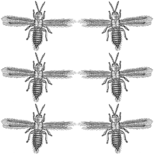
jitterbug
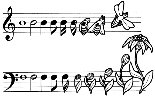
I was REALLY short on time for the next issue, having several other pending projects that demanded a lot of computer time. I remembered that I had several music illustrations that featured insects, which I'd drawn for recital posters during my college days. I scanned one, cleaned it up, got rid of the text that surrounded it, and plopped it into the newsletter. "Musical Bee" is from my metamorphosis period, in which I was especially fond of Escher's works on a similar theme. I just had my own twist to the idea.
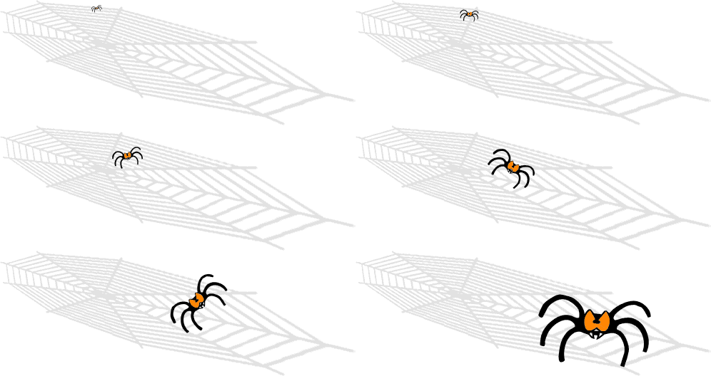
Time for Halloween themes again. I love these, since there is such a wealth of images and symbols associated with the holiday. This time I used a font for the newsletter heading in which every letter had a 6-legged "spider" attached at the bottom. That cute little bug became the model for the animation, which involved creating a web in a program called Serif DrawPlus, tilting it for perspective in PhotoShop, and using resizing to get the spider from tiny to large as it charges forward. The way it runs forward gave me the impression of the title: "Nightmare." This, as with all my animations, was eventually constructed using Ulead GIF Animator Lite Edition, a little freeware program that I've had for years.
 |
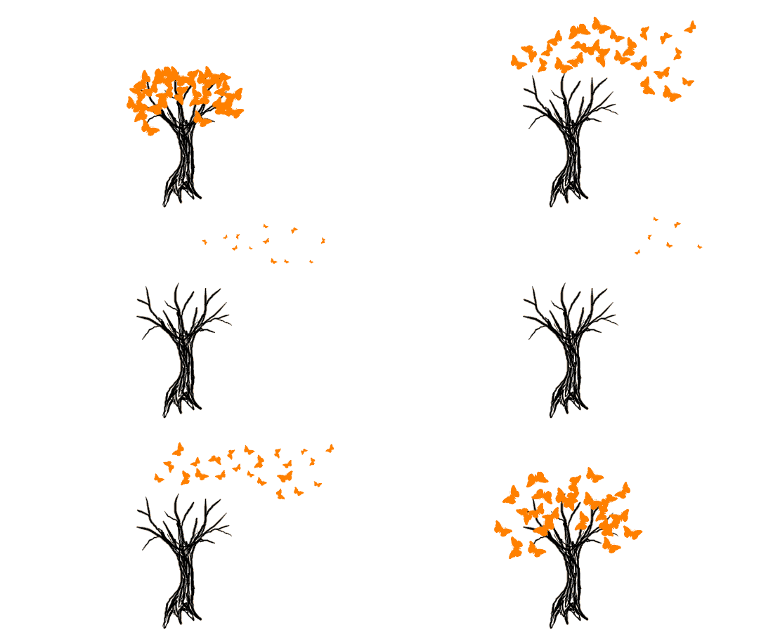
Here in the south, we don't think about autumn leaves falling until nearly the end of the year. Sometime in November, the leaves do start to change color, and this year we had the added effect of heavy rains after a prolonged severe drought. Many trees put out new growth in Oct. as if it were spring, only to then react to the usual autumn changes just a month later. Caterpillars also flourished in that brief period, sometimes defoliating the fresh growth off of entire trees. That gave me the idea of the butterflies covering the tree like leaves, not to mention the annual migration of the monarchs, which sometimes passes right through Austin. I used a tablet (Bamboo by Wacom) to quickly draw the tree. The butterflies were a single character out of a dingbat font, multiplied, resized and manipulated. Yes, "Butterfly Tree" was a little time-consuming, but not really too bad.
 |
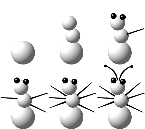
I was thinking snow for the Dec. issue and it was pretty easy to imagine changing a typical snowman into a "Snowbug" with just a few simple additions. The program used to make the spheres was ZPaint, which doesn't really do much else, but is quite useful for this application. Making the added limbs match the "look" of the rest was accomplished using characters in a font and manipulating (stretching, skewing) them in Ulead Photo Express. This animation was relatively stationary, so it was possible to create a transparent background without increasing file size.
Because we publish our newsletter in the middle of each month, the Jan. issue has to look forward to Valentine's Day, which always seems a bit premature after we just had our Christmas themed issue the month before. However, I do like the pretty hearts, flowers, and love ideas for the graphics. This time I used a graphic font with nice hearts all around. We just got back from a trip to Wisconsin, and that long drive from Austin to St. Paul on I-35 gave me plenty of time to think about our nation's Heartland - the Midwest. Thus was born the idea for "Wandering Through the Heartland" which is just another of my silly puns. The little bug was modified from one I'd created awhile back for our clipart site. It actually takes more time than it is probably worth to make the little insect crawl all about like that.
 |
I like to vary the colors of our headings from month to month, and often make the opening illustration match. In this case, the graphic font (by Darrian) that I used had matching spot illustrations. It was an easy task to alter one just a bit so that I could make simple animations where the butterfly appears to flap its wings. The idea and the title "Subtle Blues" sort of came to me simultaneously, and they just seem to belong together. A Blue is a kind of tiny butterfly that is really shaped much like this graphic. Changing the timing on each butterfly (they are all separate files) makes their wing motions look very random. Of course I added one that doesn't move, but it takes awhile to figure out which it is.


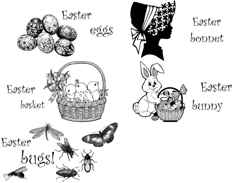
The Easter issue often uses at least one associated image, but this time I decided to use several traditional Easter "things" as well as my own added one. The various black and white vignettes are basic clip art, with a curly font that just seemed to fit the theme. Using Ulead Photo Express, I can easily add the words I want to each frame. When animations are this simple, it is easy to make them transparent so that it looks like they are almost printed on the page.
Time for a still image. The title "Dung Beetle Cosmology" was given after the fact; it just seemed to fit. The entire image was created in Ulead Photo Express out of dingbat font characters. The font bits were turned, made 3D, colored, and shadowed in the program. I like the way the Earth image takes the place of the dung beetles' ball.
 |
The following animation was prompted by a cluster of web-forming caterpillars that I found recently. I wanted to determine what species they were, so I kept the whole branch in a cage and was rewarded with over a dozen little moths that emerged all at the same time from the mess of leaves and silk. Of course, they didn't pupate in the same cocoon, but I took a little artistic liberty with "Caterpillar Slumber Party" and imagined them having some fun while waiting to emerge as adults. The entire animation was created from fonts (both dingbat and regular), as I am too lazy to draw images myself.
Caterpillar Slumber Party |
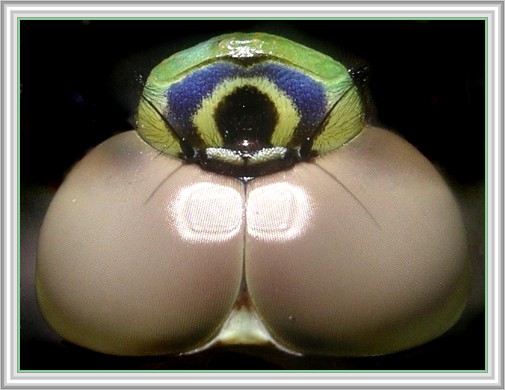
I don't use photos all that often but this one struck me as a perfect opening image. "The Eye" is a photo of the head of a Common Green Darner, a kind of dragonfly. I found this individual near a stream, from which it had recently emerged. Still too weak to fly, I could hold it and photograph it up close. The strange tan color of the eyes is due to how recently it had molted. The central "eye" is simply a marking on the front of the face. The true colors of the photo matched those of the letters that I used in the heading. I did darken the background a bit in Photoshop, but otherwise the image is not altered.
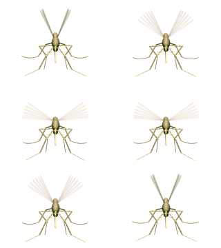
By July, we are often in a lengthy time of drought, but this summer we have had ample rain. The mosquitoes are taking full advantage of all the temporary puddles and pools and they are numerous and voracious. The reference to the Gershwin song, "Summertime," came to me first while I was driving across town one morning a couple years ago, enjoying the light traffic due to school being out and the Legislature out of session, and thought about the tune with the words: "Summertime, and commuting is easy..." Okay, that's a long story for a short idea. I was introduced to the term "mossies" by a friend in Australia. She routinely uses that reference, and it IS easier to just drop a syllable in conversation. The insects are from a clip art disk. The words were manipulated using Ulead Photo Express.



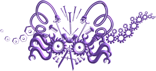
Isn't this next one cute?! I had written an article about outdoor "yard art" or art made from junk, often displayed in peoples' yards. I found a font that fit the theme and then just used elements from that, manipulated in Ulead Photo Express, to create my own "Junkbug." And it doesn't even annoy the neighbors.
I thought the next idea was rather clever, but it seems that most people did not get it. When I asked a few friends and family what they thought of "Roach Test," responses varied from not noticing the word "Roach" to not knowing it was an inkblot test to not seeing that the "insect" was squished to never having heard of Rorschach. Sigh. It's not funny if it needs to be explained. I had even found the original images that Rorschach used online and started with one of them to create my own. Authenticity that was completely lost on most viewers.

With Halloween coming up, I went for something far less esoteric this time. Pretty self-explanatory, I hope. I started with a clipart pumpkin and drew the worm in MS Paint. The words were manipulated in Ulead Photo Express.
 |
Playing around with fonts in Ulead Photo Express is so much fun that I made the next image completely from dingbat font characters. This one is called "Autumn Butterfly." Couldn't come up with an animation idea that month...

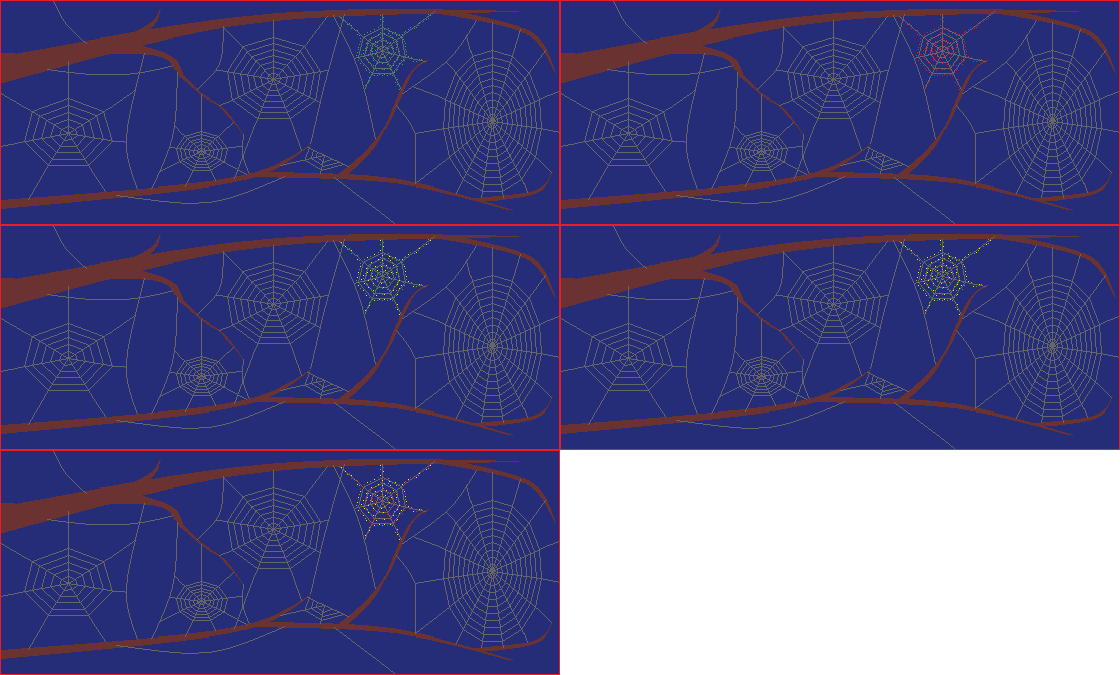
I don't like to waste our Dec. issue animation on anything other than a Christmas theme. I had been trying to figure out something with a decorated spider web, and finally worked out how "Web Lights" would look (in my head). It took a bit of time to do the tiny color changing lights, but it was pleasantly mindless. The webs were created in Serif DrawPlus with a function called "quickweb" which, as you might expect, creates instant spider webs. After the initial sweep to create the general shape of the web, it can then be adjusted with little sliders: how many spokes, how many spiral threads, and rotated. Very nifty. The additional threads were added later, with MS Paint using the curved line function. It's a whole lot easier than trying to hand draw a smooth curve!
 |
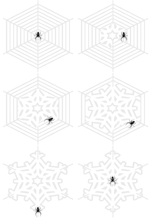
I had another so far unused idea for a spider web, and, since January is such a cold month, decided it would be okay to do two spider themes in a row. This idea had come to me some time ago, but I hadn't figured out a quick way to create it. I do all this planning part when I have free mental time, so it doesn't seem like I am wasting my time sitting in front of the computer creating graphics. When I do start to actually create an illustration, it usually happens pretty fast unless I hit a snag. This one went smoothly. I took a clip art snowflake as one image, made a quickweb in Serif DrawPlus, and simply put it on top, gradually erasing part with each frame. I'm sure there is a simple way to do this with layers in Photoshop, but learning it is not simple and I find layers to be mystifying and terribly cumbersome to work with. Instead, just pasting in MS Paint works great and takes no practice at all. There is that neat little function where you can make the white parts of an image transparent - very handy for this sort of thing. After the whole thing was completed, I added a spider character from a dingbat font, moving it around without making it actually change shape or anything more complex. Long explanation for a simple idea, no? It's called "Winter Web" and only really makes sense here in the south, where we actually do have spiders in the middle of winter, at least on warm days.
 |
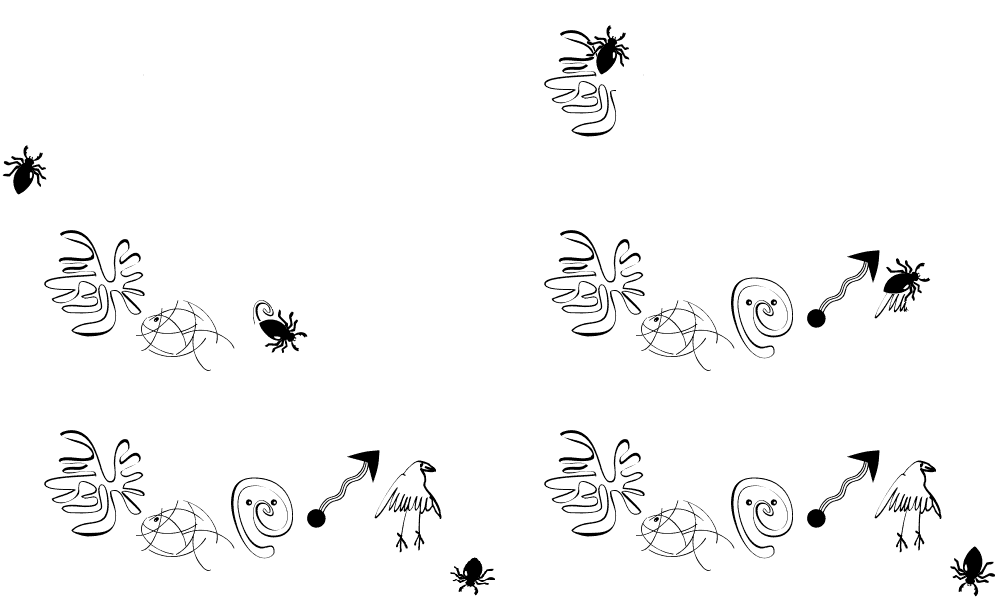
I am surprised that I had not thought of "Doodlebug" earlier, since I love those little visual puns. The actual execution of the graphic was a cinch, as the entire thing was done using dingbat font characters (obtained from the king of doodle dingbat fonts, Manfred Klein). Some viewers believed the individual drawings that the bug produced had some deep meaning. They don't; I just chose them because they looked cool. My favorite part is the nonverbal "giggle" that the bug does at the very end.
 |
After finding a dingbat font that featured mazes, I couldn't pass up the chance to use one. Having a graphics program that manipulates fonts in a simple way is definitely an asset. I use Ulead Photo Express. I can change the color and add 3D effect and such with ease. The ant in this graphic was one that I had drawn pixel by pixel some time ago for some other animations so I already had both the perpendicular and the diagonal versions ready for use. The little nuclear explosion at the end goes along with the title: "Antintelligence." Get it?
