
I like the idea of light or color changing in an image, rather than having distinct motion, and this reminds me of the wonderful color wheels used on Christmas trees. This one is called "Butterfly Shine." Of course, it is more of a fallback option when I can't think of any concise joke, pun, or other play on words, settling for a pleasing image instead of one that takes more mental effort. The red streak of light was added in Photoshop Elements 2. I can't really remember just how I did it, but I think I used the clone tool. Its also nice to occasionally use a colorful illustration because I often use black & white for GIF animations.

One of my better efforts, "Triumph of the Termite Tree" is a pleasant, light-weight visual, tells a simple story, and has more than one influence. The most obvious reference is to termites, which eat wood, but this tree manages to grow back and heal itself. I like the alliteration, as well as the victorious vegetation. There is also the aspect of the oak wilt that has decimated the large live oaks in our neighborhood. There can also be a deeper meaning, if one is into that sort of thing, conveying strength, resiliency, recovery and perseverance, with a nod to a divided entity reuniting. Wow - that's REALLY deep.

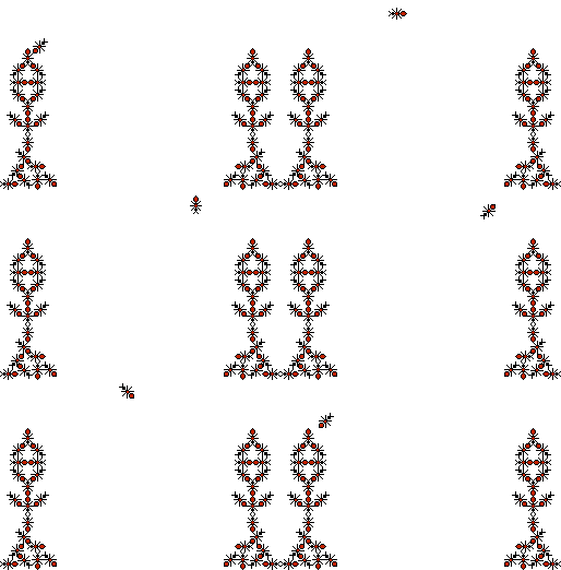
Double-meaning time. "Acrobat Ants" refers to both a kind of ant (Crematogaster spp.) and the antics that these little animated characters are engaged in. By the way, real acrobat ants have pointy rear ends, since they have a tiny stinger, so the drawn ones are quite true to form. Here's a bit of entomological trivia that many people don't know: in the order Hymenoptera, which includes ants, bees and wasps, only females have stingers and all workers in social colonies are that sex. I created the insects as pixel art quite a long time ago, so it was just a matter of arranging them and making one spin across the void. Silly fun.
I'd been listening to Henry Mancini's music to "Pink Panther" and so had the idea of a gemstone with an embedded image in its heart. "Iron Emerald" is named for the encased insect, the ironclad beetle, and the color happened matched the graphic letters I used for this issue. No animation was necessary for this concept, but it took me quite awhile to remove the background from one of my beetle photographs so it would be appropriate in this setting. I think the resulting image is particularly attractive.
 |
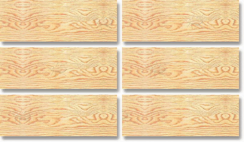
Just as with the recent acrobat ants, "Wood Roach" refers to both a real insect and the hyper-camouflaged creation presented here. Wood roaches are not really named because they look like wood but because they live in forested areas. Many insects do sport very convincing camouflage, though few are as cryptic as this ghost-like invention. Using a clipart board overlaid with a transparent but 3D effect dingbat font character produces a rather neat effect, just barely visible.
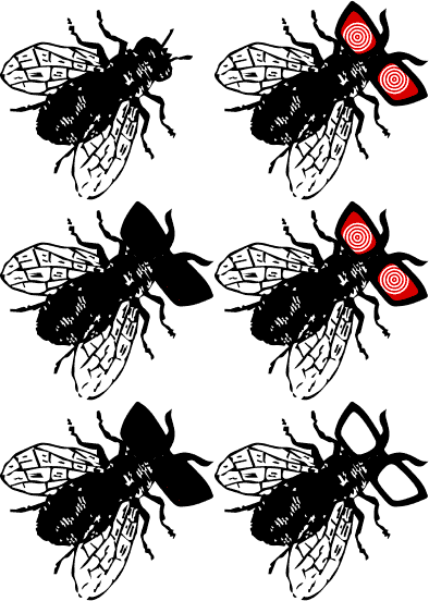
Even for a pun, this one is sort of stupid. For anyone who is not familiar with house flies, fly specks are the tiny droppings produced by the pests, often too obvious on light-colored kitchen countertops and plates of food. There is a big box liquor store near us called Specs. I have no idea what eye glasses have to do with booze, but you see where I got the idea for "Fly Specs." I decided to make them outlandish.

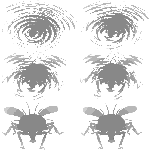
While pondering Halloween imagery, I thought of ghosts and realized that if I started the series of three Christmas ghosts in Oct., it would conveniently end in Dec. The title "Ghost of Insects Past" was easy enough to come up with, but the satifactory execution of the animation was not. I figured that I had three chances to get a good one, so I gave it a try, using various filter effects available on PS Elements 2. This first try seemed rather mediocre. The use of a damselfly, though, is appropriate, as odonates were among the first insects to fly.

My second attempt at a ghostly insect turned out even worse than the first. "Ghost of Insects Present" probably used the wrong image to begin with because I'm not sure what the heck it is supposed to be and I am familiar with most extant arthropods. It might have been better for the 'yet to come' one. Anyway, it turned out to be too heavy (bandwidth-wise) for my taste so I reduced the number of colors and screwed up because the grays didn't blend nicely. I did like the spiral inception, as well as the eye blink at the end, but otherwise I am not at all satisfied with this one. But I'd spent enough time on it and so didn't try fixing it up any better.
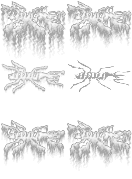
Okay, time for third try on the Christmas ghost theme. I'm pleased to say that "Ghost of Insects Yet to Come" is much better than its predecessors. The misty part is nicely reminiscent of snow, which is totally appropriate for the Dec. issue, and the transformation is rather graceful. I used a termite because they are pretty adaptable and will probably inhabit Earth for a very long time, no matter what changes occur.
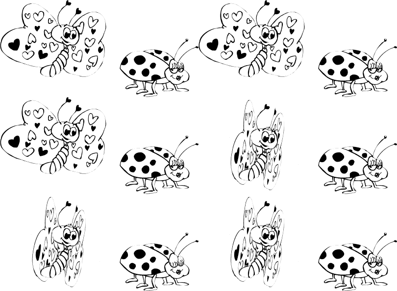
Procrastinating until the last moment left me very little time to come up with an idea for the Jan. issue, which often includes Valentine's imagery as that holiday occurs before we publish in Feb. Browsing through insect-themed dingbat fonts, I happened to see a couple of characters that looked good together in a cartoonish way. The hearts in the butterfly's wings and the cute look of the lady beetle were perfect for this little illustration. All I had to do was make the wings beat and the eyes blink, easy enough in Ulead Photo Express. Yes, I still use that old 1990s program on Windows 10. I think the funniest thing about "Bugs in Love" is the fact that they are different species (as well as in different orders!), which might seem indecent to those with high moral standards, or simply mean that there can be no successful consumation of their infatuation.
 |
After over two decades of publishing our newsletter, we decided to call it quits. Just too many other interests and not enough time. Unfortunately, I didn't come up with some profoundly superb illustration for our final issue, just a lame pun: "Crane Flies." Considering that this one is sort of in the middle of my quality spectrum, it's probably an appropriate farewell to my GIF animation career. It's been a lot of fun, but I'm just glad that I don't do everything this badly.
 |