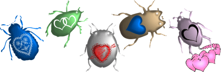
I really couldn't think up anything interesting for the Valentine's issue this year, so simply played around with some dingbat fonts. The name, "Love Bugs," was the most clever part of the illustration. I feel like this lame graphic requires an apology!
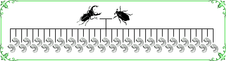
While I like the idea behind "Bug Family Tree," it wasn't an animation and didn't feel like one of my better efforts. I suppose it helps to know that male and female stag beetles look quite different, and that their babies are grubs. This is probably one that appeals more to biologists. At least the lovely green frame matched the heading letters used on this month's newsletter.
No great burst of creative inspiration was produced by the Easter issue. I reused an old idea of a line of ants carrying stuff on their backs. Still, it looks sort of nice, even if there is no punchline. This is a combination of three separate files.
I finally had an idea that made me smile. I like to create graphics with a bit of humor, especially if they have a surprise ending that likely elicits chuckles rather than groans. I used various font characters for all aspects of this animation. The timing of the various frames took some tweaking as I wanted viewers to be able to both read the poem and follow the action of the images.
Sometimes the inspiration for an illustration comes in a rather roundabout way. It's quite obvious that the following is a take-off on "the birds and the bees" but I only thought of it because I wrote an essay for this issue called "Bee-havior." Yes, it was simply about various things that bees do. Once I get on a roll with a theme, I exploit it fully; another feature, the Backyard Beast, was a Bee Fly. I think the fact that it was spring started the whole process. I also really like alliteration, as well as the fact that lots of insects' names start with B, and also B and Bee sound the same. Well, you get it. I started with the most socially acceptable and proceeded to the grossest. The only thing I am not satisfied with is the title. Quite often I come up with a title first, but this one was named after it was finished and just isn't all that clever or interesting: "B & Bs."
All the animals are dingbat characters. I've found that playing around with these brings the same satisfaction that I felt making collages as a kid. Arranging several objects into a picture is just plain fun!
Every year, the Independence Day issue provides ample grist for the animation mill. I also just like the idea of blowing things up. "Bug Burst" is a series of five individual files, all with different timing. The colors were determined by the letters in the heading that month - orange and sparkly. In fact, I just used elements from the letters for the explosions. The color of the insects was simply an aesthetic choice. The nice 3-D effect of the images was created in my little Ulead Photo Express program.


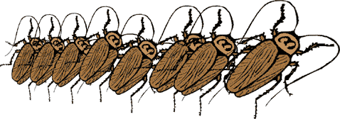
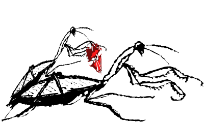
Time for alliteration again, with "Cockroach Conga." Any animation that only takes two frames is quick and easy to make, and using a clipart image to begin with makes it all the more simple.
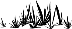
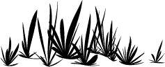
The whole idea for "Transformer" came when I was scanning through a series of line drawings of trilobites. I noticed how it looked very organic as one image replaced the next on the screen. I simply had to line up each subsequent image so that it centered on top of the last. Nothing complicated, but it is fun to watch. Since the animation was so compact, I needed something to stretch out the filled space into more of a horizontal canvas. The grass-like silhouettes are actually characters in a dingbat font. Elegant, aren't they?
  |
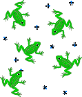
It had been raining in our area (which doesn't always happen with any regularity), and for some reason the pun "Raining Gnats and Frogs" came to mind. Making the frogs catch the gnats and then having the whole thing "rain" down took a little bit of work. As is obvious from the repeated pattern, there are three copies of the same animation side by side. For some reason, making this one transparent worked very well.
 |
I do enjoy playing with words, and coming up with things that are ALMOST the familiar Halloween chant was a lot of fun. Illustrating them was even more engaging. All the images are, once again, dingbat font characters. The title is "Get It Right!"
Knowing how voracious fire ants can be, I have long thought that a good Thanksgiving image would be the elegantly alliterated "Fire Ant Feast." I kept playing with ideas of how to illustrate this, perhaps with an animation of ants carrying all sorts of parts of their prey. Nothing ever really seemed to work, though. Then I thought of a grasshopper, which I really HAD recently seen being eaten by ants. Then the Aesop fable came to mind. It turns out that the idea needed no animation, as a single frame says it all. This one even has a subtitle: "Fire Ant Feast, or What Really Happened to that Lazy Grasshopper!" I'm really hooked on using dingbat font characters as art. They are so easy and fun to work with.

The familiar Christmas song was certainly the inspiration for this next animation. I like the double meaning of "rock." My only problem with this one was file size. It uses an embarrassingly large amount of bandwidth - nearly 100 KB. Of course, with just about everyone having high-speed internet nowadays, it is not the problem it would have been five years ago, but I am generally a frugal person and hate to waste bandwidth on silly jokes. Once again, every aspect of the drawings is a dingbat font character. I had to use a potato (decorated with doodles from a different font) for the rock, but they look the same anyway. The whole thing moves in tempo with the rhythms of the song, so you can sing along if you want.
 |
Everyone knows the myth that a female praying mantis always eats her mate, usually biting off the head. It is a myth because this is only usually true of captive animals, where the male cannot escape and the female feels stressed out. In the wild, it probably happens very occasionally. "Tough Love" seemed like a nicely titled graphic for the Valentine's Day issue, and it gave me yet another opportunity to play with dingbat fonts, manipulating them in Ulead Photo Express. The red gift box matched the letters used in the heading of the issue.
 |
I couldn't help but notice the similarity between the figures in an explanatory square dance animated GIF and bugs. It took a lot of pixel counting to make sure that everyone had room to maneuver and also ended up in the right place. Since a Big Grand Square is just a group of four Standard Grand Squares, then this assemblage must be a Super Duper Extra Large "Grand Bug Square." But then that is how it is with bugs - there are always lots of them. The whole animation was done in MS Paint and compiled in Ulead GIF Animator Lite, still my standard method of creating these.

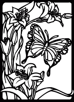
I'd worked pretty hard on the previous month's animation, so I took it easy for the next illustration and went with a still. "Lepidopteran Equinox" is one of those Yin/Yang kind of picture - opposites juxtaposed. I liked the idea of the diurnal butterfly and the nocturnal moth getting their equal times. All the pieces are dingbat font characters. The gradient backgrounds are the sort of thing that is easy to do in MS Word. One of the trickier things is to put something with white in it over a colored background. The way I do it is too complicated to explain here. There is probably a much simpler solution but I have not yet mastered it.

The inspiration for "Beach Ball Bugs" was a dingbat font with nothing but balls with various sorts of shading or designs. I like the way the bugs sort of squash down when they are hit by the ball.
 |
I'm not sure why the idea of "Seed Bugs" had not come earlier. There is a whole group of true bugs called that. In this case, though, the seeds of a clip-art watermelon suddenly come to life, which I think is darkly humorous. Sort of like biting into an apple and finding half a caterpillar in it.
 |
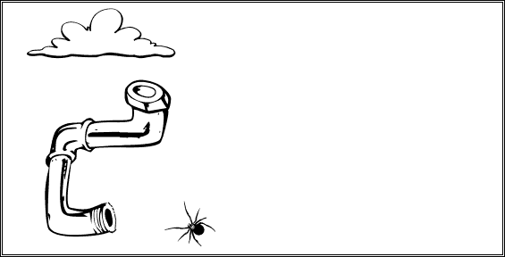
Zip-lines are not particularly big here in central Texas, maybe because we just don't have big trees. However, I've seen these in Florida, where they are hot. Not surprising for a whole state that caters to tourism and outdoor recreation. Spiders regularly use their silk to bridge the gap between trees, so it makes sense that one might have a little fun as a "Zip-line Spider," at least in my imagination. I especially like horizontal designs, as they fit well in the format of our newsletter.
 |
I had taken some close-up photos of a robber fly and thought the enormous eyes looked quite abstract. In order to achieve better symmetry, I took half the photo and mirrored it. It is quite similar to the original, but of course more perfect in every detail. The color is true. I thought "Fly's Eyes" meant just that: the compound eyes of a dipteran. Well, a quick search on the internet showed that it is used in other ways, especially pertaining to a part of the male anatomy that also has two matching spheres.
") |
Sometimes an animation isn't about action, but about examples. I couldn't help but come up with more "Beetle Bumper Stickers" after imagining the logo of "Grub on Board" on the back of a Volkswagen. The old engraving of a Hercules beetle seemed just right for plastering various sayings onto. For those that don't get the "Kiss your ash goodbye" one, it has to do with the Emerald Ash Borer, an invasive exotic green-colored bupestrid beetle that is decimating ash trees in our country.
 |
This pun is so obvious that I can't believe I didn't already use it. "Fire Fly" was created using a text effect in Ulead Photo Express on a dingbat font character. Of course, this insect is different from the real firefly (actually a beetle with a glowing butt). That distinction is exhibited in the name: true flies, in the order diptera, always have a space between the adjective and the word "fly."
|
