 |
It was time for an Easter theme, so why not have an "Easter Butterfly" instead of an Easter Bunny? Although still highly improbable, a butterfly is more likely to lay Easter eggs than a rabbit is! All the elements in the animation are from dingbat fonts and were manipulated with Ulead Photo Express. I do like that little program.
 |
Anyone who has kayaked or canoed on a lake that allows motorboats will get the gist of "Pond Skaters." Yes, I think that people who like to race their fast boats like that are the bullies of the waterways, and there are plenty of them. The entire animation was drawn in MS Paint.
 |
Time for a graphic poem. You can sing "Twinkle Firefly" in your head. I meant for the final line to bring a smile, but maybe it's too true and therefore not all that funny. I like using fireflies, or lightning bugs, in animations because I don't really have to draw anything, just make a little blinking dot. It's trickier to time the text and the blinks than you might think, as they change at different speeds.
 |
By the July issue in 2011, we were in the midst of the worst drought and heat wave that anyone under the age of 70 could remember. We'd had a string of 100°+F days that was getting downright depressing. Hence "Beetle Rain Dance." I used a clipart beetle, but it only came in a diagonal version so I had to draw a vertical one to get the range of motion that I wanted for their perky little dance. I thought the red color goes well with the idea of sunburn. The actual graphic file consists of a separate sun (another clipart find) and a single beetle. The file is repeated to make the whole line. Since they will all load at the same time, their movements are perfectly synchronized.
 |
optimism...
While brainstorming with my husband about my lack of ideas for the next month's animation, the idea that our drought and heat wave had continued, unabated, for yet another month, led to a sequel of last month's idea. It would be possible to string this out for a few more months, but I sincerely hoped that it would not be necessary. The character of "Beetle Rain Dance Continued" accurately reflects how most people were also feeling.
 |
still at it...
And the drought, as well as the beetle story, continued for another month...
 |
yeah, another month and still at it...
Although the drought continued, we had gotten to October, which is when I usually cannot resist using a Halloween theme. Well, put 2 + 2 together... er, beetles + spider.
 |
By November, I was getting tired of the beetle rain dance and the drought (which continued). It wasn't even funny anymore, and I certainly did not want to extend this to Christmas. Thanksgiving offered a good way to clean up the mess, with "Turkey Treat."
 |

gobble, gobble, gobble...
Although I had ended the "Beetle Rain Dance," I had not come up with a good replacement idea, so it was time to take a break from animations. I like playing around with collages; it reminds me of the fun I had with sticker books when I was a kid. Just put all the pieces on the screen and move them around until they look nice. All the bits of "Festive Butterfly" were created using dingbat fonts. The combination was made in Ulead Photo Express. Considering that I acquired that program with our first scanner, if I remember correctly, I have certainly gotten a lot of use out of it. I wonder how many readers stared at this graphic for a minute or more, waiting for it to do something...
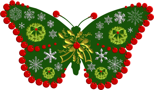
With the January issue comes the chance to use a Valentine's Day theme, as that holiday will occur before our next issue on the 21st of the month. The idea of themed butterflies was still with me, so I executed another holiday-appropriate insect. This one was not so complex as the previous, and so could be made to move. The wing flick is accomplished by using major distortion on the dingbat font characters that form the butterfly. Each character is a separate file on the image while I am working on it, so each one had to be adjusted. I only created one side, then simply mirrored it. I think this one is particularly pretty.

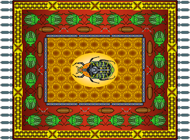
The next month I was in the mood to do pixel art. For the uninitiated, pixel art is produced one tiny color square at a time. It is easiest to do in a program like MS Paint, but almost any graphics program can be used. For "Bug Rug" I used some pre-existing images I'd already made and added colors and outlines. It was tricky to make sure that everything lined up at the corners, as this is sort of like counted cross-stitch needlepoint. I used a shaded background for part of the rug, creating that in MS Word and simply overlaying the rest of the illustration on top. This is one of the few images I've produced in .png form. I did so to preserve the large number of colors in a lossless file form with relatively small weight (only 65.4 KB).
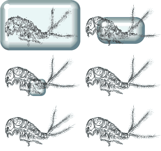
The next graphic was better as an idea than the final result. I wanted it to look like a block of ice but didn't have any good way of creating that. Instead, I used a program called La Fonta to make a rather lame ice cube. I do like the little bug and also the way it looks through the ice (done with a filter in PhotoShop Elements 2). I scanned the insect from a real clip art book, something I don't do very often. I'd have liked the graphic to be transparent but it took too much bandwidth that way and was easier to optimize with a non-transparent background. My favorite part of "Spring Thaw" is the little tail wag at the end.
 |
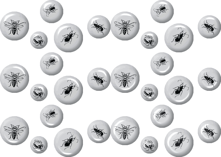
Once again, with the next image, I like the idea better than the finished graphic. In fact, I like the title more than my execution of it! "Entomological Entropy" has an obvious clever air about it, but I don't think the realization is adequate. I just couldn't think of any other way to do it. This animation was created entirely in MS Paint. I probably spent more time in the layout of each individual part (each bug is a separate graphic, but there are only five of them) as I wanted them to look randomly spaced.
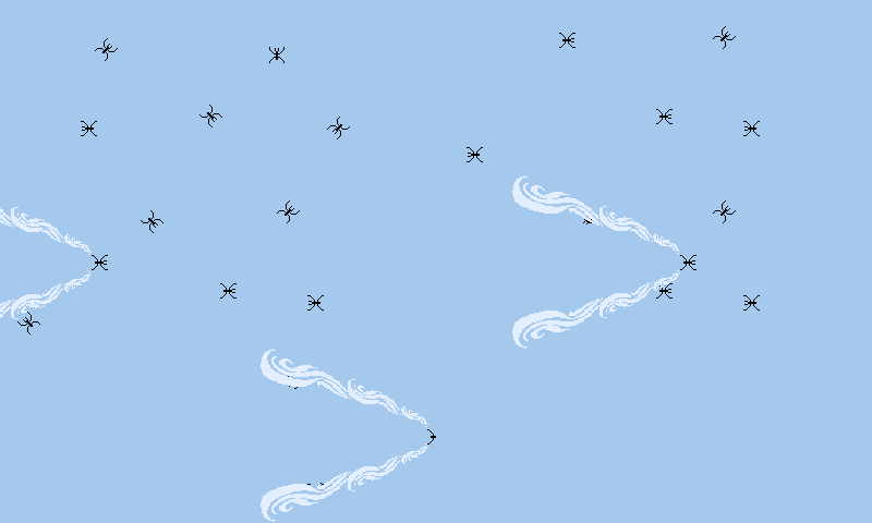
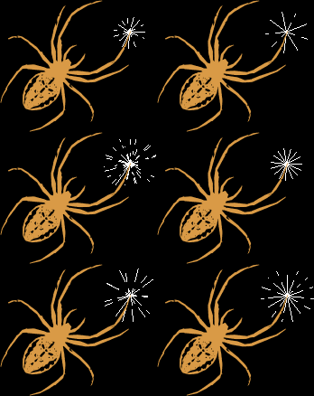
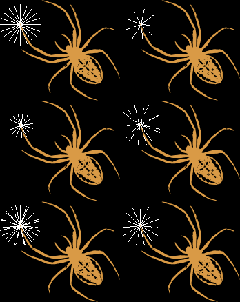
The next illustration would be appropriate for Halloween, but I used it for Independence Day. I loved sparklers when I was a kid, and "Spider Sparklers" has a nice ring to it. The white flashing sparks would have been tedious to create but I used the quickweb drawing function in Serif DrawPlus. With the various adjustments to the "web" I could get rid of the round parts and just keep the spokes. I made several different ones and then erased parts of the lines to look more like sparklers. It's not perfect, but certainly adequate for the amount of time spent.
  |
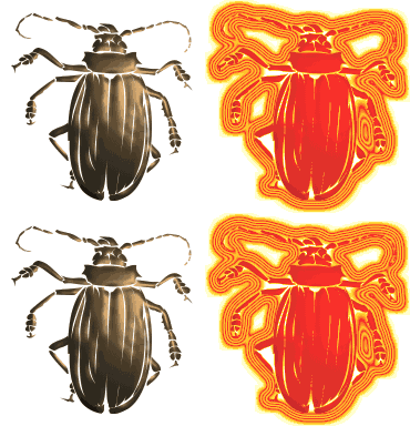
The next graphic combines the elegance of a nice colorful metallic look with a silly neon effect. The not-so-creative title "Neon Bug" came first, as I had used graphic letters for the heading that month that looked like neon lights. It is tricky to decide how to handle the color palette on animations. I prefer using a global palette rather than different ones for each frame, so when one frame is a completely different color than the next, the palettes of each need to be merged and forced to use the global set of colors. Anyone who has tried making animated GIFs will know what I am talking about while anyone who has not will be totally lost in this gibberish. The insects themselves were characters in a dingbat font. I do like Ulead Photo Express for graphically working with fonts of any kind.
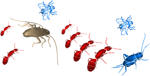
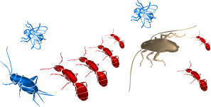
After several graphics that failed to live up to my expectations, I was pleasantly surprised by the result in "Out of the Ooze." I must have had prehistoric times, evolution, and the dawn of life on my mind. The simple lines have an appropriately fluid look to their movement, which is just a lucky accident, as I created the whole animation in MS Paint, which, as anyone who has used it knows, does not have any special helpful commands to help an artist realize their creations. Because each file had such small bandwidth, I went ahead and made six different graphics, each one with a different timing sequence. I like the random effect.
     
|
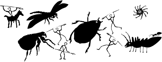
The next illustration was perfect with no animations at all, since it is cave art. I'd just watched the Disney animation "Lion King" for the first time and was thinking rock art. "Paleobugs" was made using the delightful dingbat font creations of Manfred Klein. I once again manipulated the font characters in Ulead Photo Express. This graphic felt like it needed a caption.
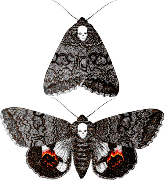
Once again the annual image-rich holiday of Halloween provided inspiration, as did a type of owlet moth called an Underwing (genus Catocala). These moths have a startle response to disturbances in which they flash orange or yellow lower wings that are usually covered. They fly a short distance and then cover the color again, effectively making predators lose their visual target. There actually is a European moth called the Death's Head Moth with a skull-shaped mark on its thorax, but I added a more obvious image to my creation. I used an old engraving of a Catocala moth overlaid with some dingbat font characters to create "Pumpkin Moth." The flaming pumpkins were produced in Ulead Photo Express using a "special fix" function.
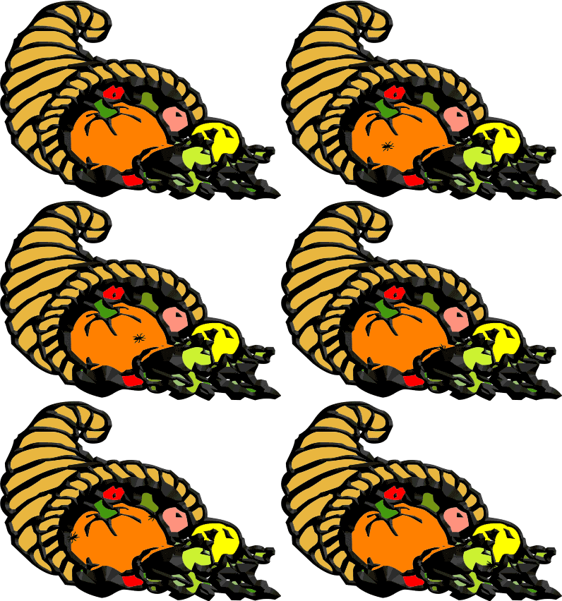
A clipart design with an added small visitor was all it took to create "Cockroach Cornucopia" for our Thanksgiving-themed newsletter. The simplified and generic look of the insect was a slight error of judgment on my part, as some people thought it was a spider. It probably does not matter much, but the gross-out factor is better with a roach.
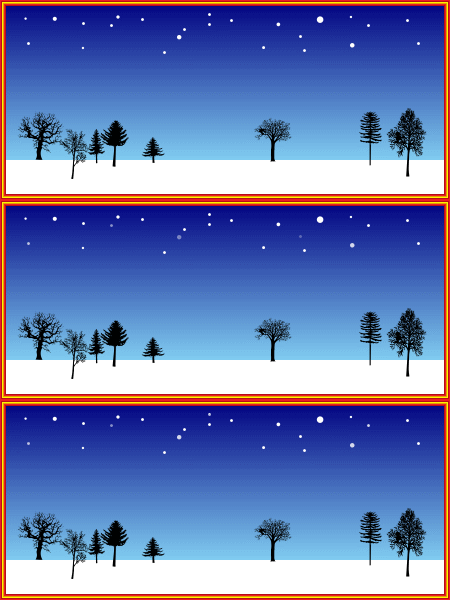
Sometimes I use very subtle jokes, to the point where nobody gets them. The whole point of "Bugs in Winter" with its twinkling stars and cold, quiet landscape is that there ARE NO BUGS in winter. It was simpler to design than to explain. Sigh. I cannot give enough praise to the creators of dingbat fonts. They are great fun to work with and come in such a wide selection that I had no troubles finding all those nice tree silhouettes.
