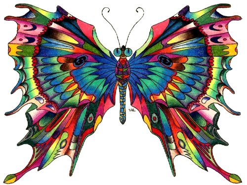
Artwork from my Color-obsessed Period
The next step was learning that there were three primary and three secondary colors in the "color wheel." Each primary had its opposite secondary. That is why traffic lights have red and green as their main hues. In my young mind, it seemed more natural that red and blue should be opposite, but the physical properties of the colors convinced me otherwise. Armed with just three colors in my little paint box, I could make a rainbow, blending each adjacent shade into the next to get the middle ones. I never have been able to grasp where we get seven colors in a rainbow. If there is an aqua between blue and green, then there should be equivalent shades between all the other primary and secondary colors too. That would make a dozen colors, but you never hear a rainbow described with that number.
Perhaps the most confusing thing about colors occurs when some well-meaning adult imparts their partial understanding of physics on young minds by saying that all colors blended together make white. They tend to leave out that little detail that light is not the same as pigment. Yes, the complete reflection of all colors of the light spectrum does produce white, while the absorption of that same set of wave lengths results in black. However, I spent some frustrating time with my water colors, trying to mix them in order to produce that elusive hue. I was sure that adding just one more color would magically turn the muddy brown into snowy white.
Because colors can be mixed in an infinite variety, it is hard to grasp just which ones will produce some of the more complicated hues, such as magenta, mustard, peach or chestnut. Luckily, the Crayola company came to the rescue of countless numbers of color-starved kids, with the production of those fabulous boxes of crayons that included dozens of exotic shades. How else could we have figured out rose, lavender, rust or mahogany? Not to mention the wondrous metallics: gold, silver, and copper.

I was intrigued not only by the colors that I applied to the paper, but to the paper itself. I am old enough to remember when standard letter-size 20-lb bond paper came in only a handful of colors. My father was a printer, so I learned early that the colored reams of paper for printing fliers, handouts, and small posters came in only pink, blue, green, canary and goldenrod. All these were pastels, meant as backgrounds for black ink. If you wanted to do artwork that had a different background, the only choice was rough construction paper sold at a premium in the art supplies section of stores. I was thrilled when, one day, my father brought home some sheets of paper that were a light orchid color. Variety! A few years later, intense bright colors of paper would become commercially available, and the original five pastels (two of which were yellows) were all but forgotten.
Since our world abounds in color, it almost becomes one of those things that our brains choose to ignore as a superfluous detail. However, even as we grow older, our fascination with color persists. Nobody can resist the temptation to play with prisms, turning that invisible white light into the familiar arrangement of all the colors of the rainbow.